Visual Identity for AI Plaza Shopping Mall
Brand Identity Guidelines for A.I (Art + Intelligence) Plaza, a shopping mall located in Shanghai, China.
Role
Lead Graphic Designer
Industry
Retail and Architecture
Duration
4 weeks

Project Overview
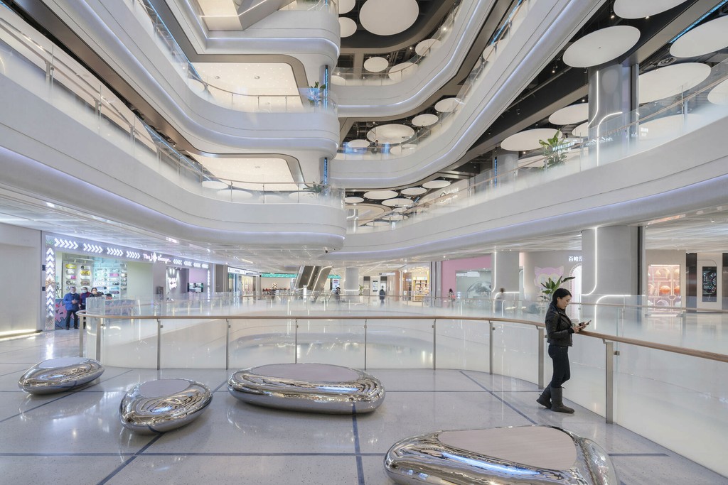
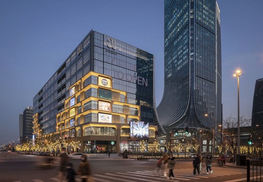
AI Plaza, located in the heart of Shanghai’s West Bund, redefines the shopping experience by blending cutting-edge technology with modern art. As a central hub in the district's Art and Media Districts, AI Plaza is envisioned as a "Borderless AI Cloud," where art and intelligence coalesce seamlessly.
In my role as the Lead Graphic Designer, I was responsible for creating a visual identity that echoed the innovative architecture and vision of the plaza. The goal was to harmonize AI Plaza's architectural aesthetics with a brand identity that represents the fusion of art and technology.
Inspiration & Concept Development
The design concept emerged through close collaboration with Woods Bagot’s architectural team. Our theme, "Cloud Space," symbolised the fluid and dynamic intersection between art and intelligence. This cloud-inspired motif became the foundation for the brand’s visual identity, from logo design to signage, ensuring cohesion throughout the project.
Brand Guidelines
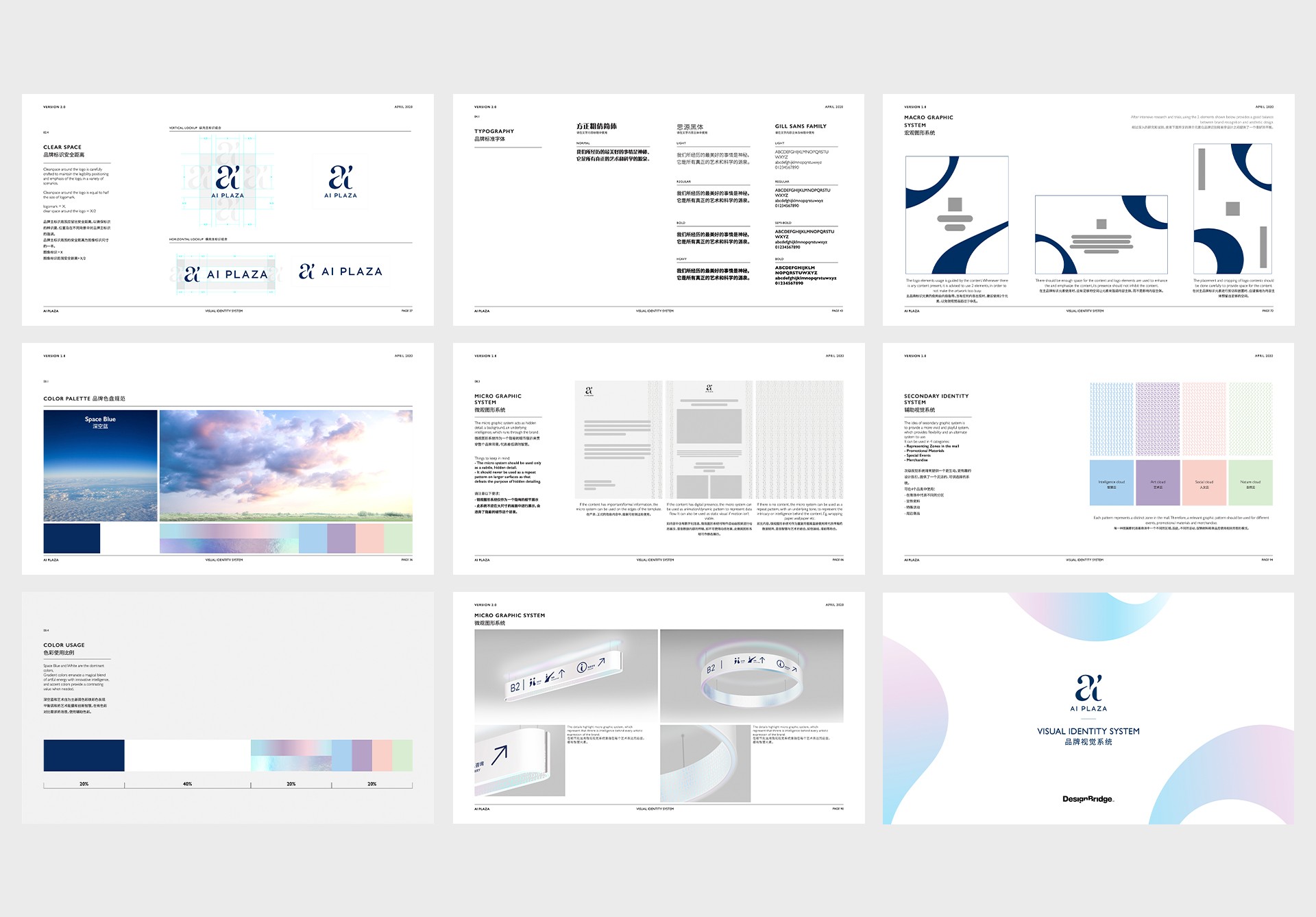
To reflect AI Plaza's dual focus on art and technology, we meticulously crafted brand guidelines that embodied flexibility and sophistication. The guidelines ensured a unified experience across all touchpoints, allowing the visual identity to resonate with the space’s futuristic and artistic qualities.
Logo Development
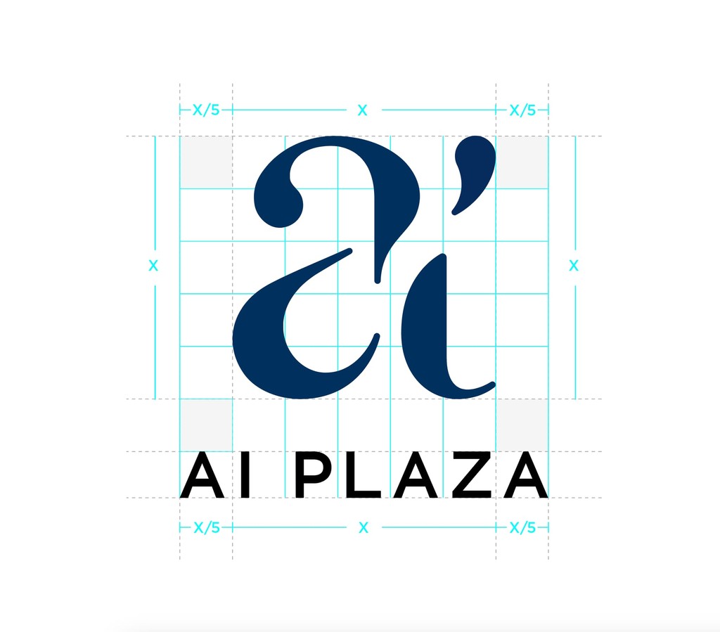
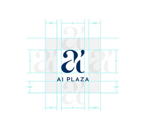
The logo design was a key component of AI Plaza’s visual identity. Using simple, crafted shapes, the logo maintained legibility across all platforms and scales. The spaces between the shapes created a sense of flow, capturing the brand’s essence of convergence between art and technology.
Colours
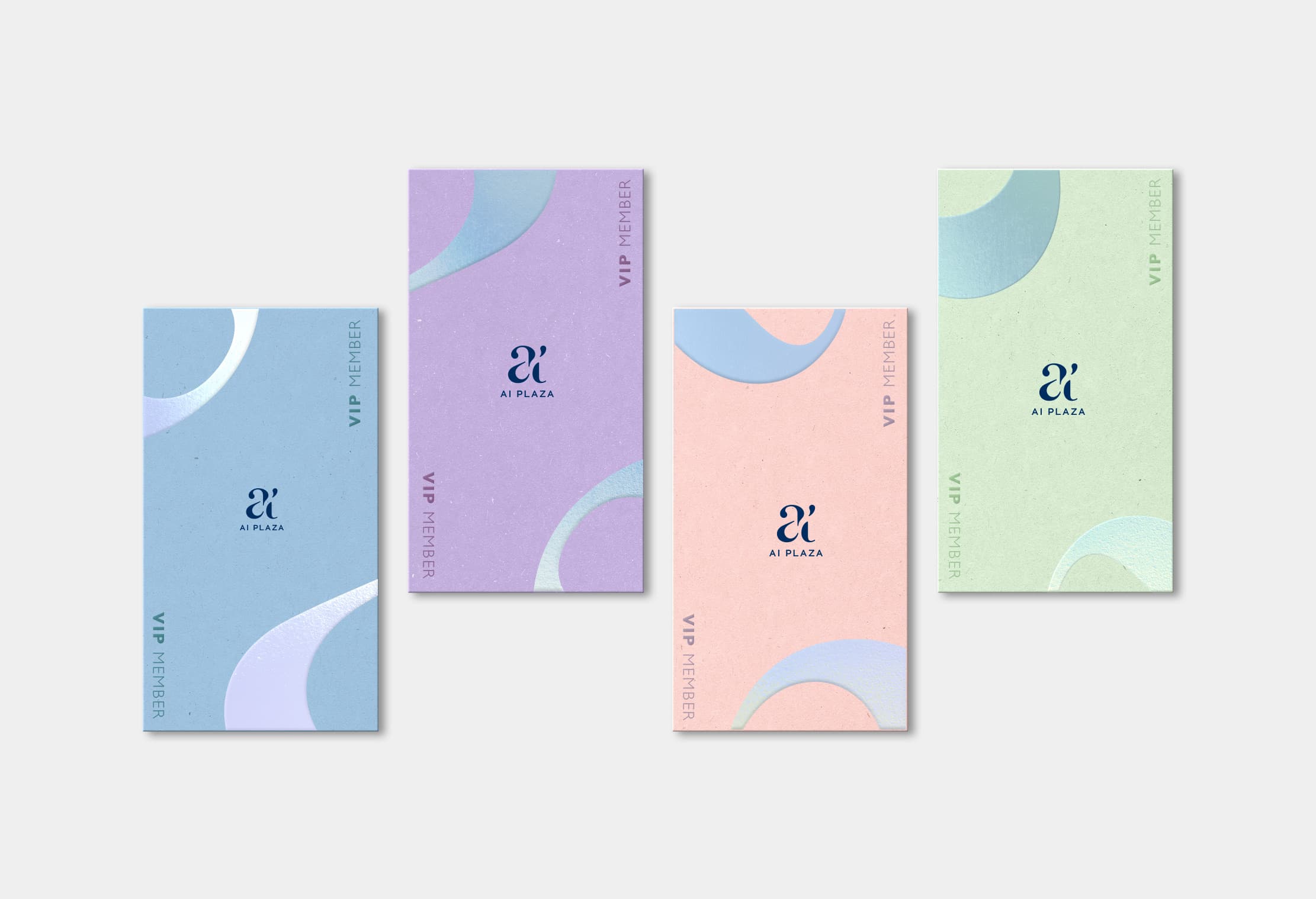
Primary Colours: The primary brand colours are white and space blue.They are used to provide accessibility, simplicity, and consistency throughout all brand communications.
Space Blue
Artistic White
Artistic White
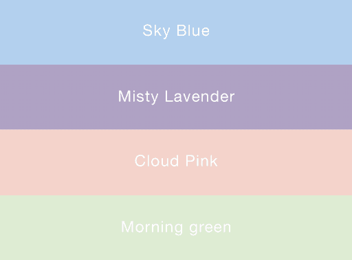
Secondary Colours: The secondary brand colours are primarily derived from the clouds, sky and nature. The colours are further refined to build a cohesive balance with the interior space of the shopping mall. Secondary brand colours offer a dash of energy and vibrance to the brand.

Graphic System
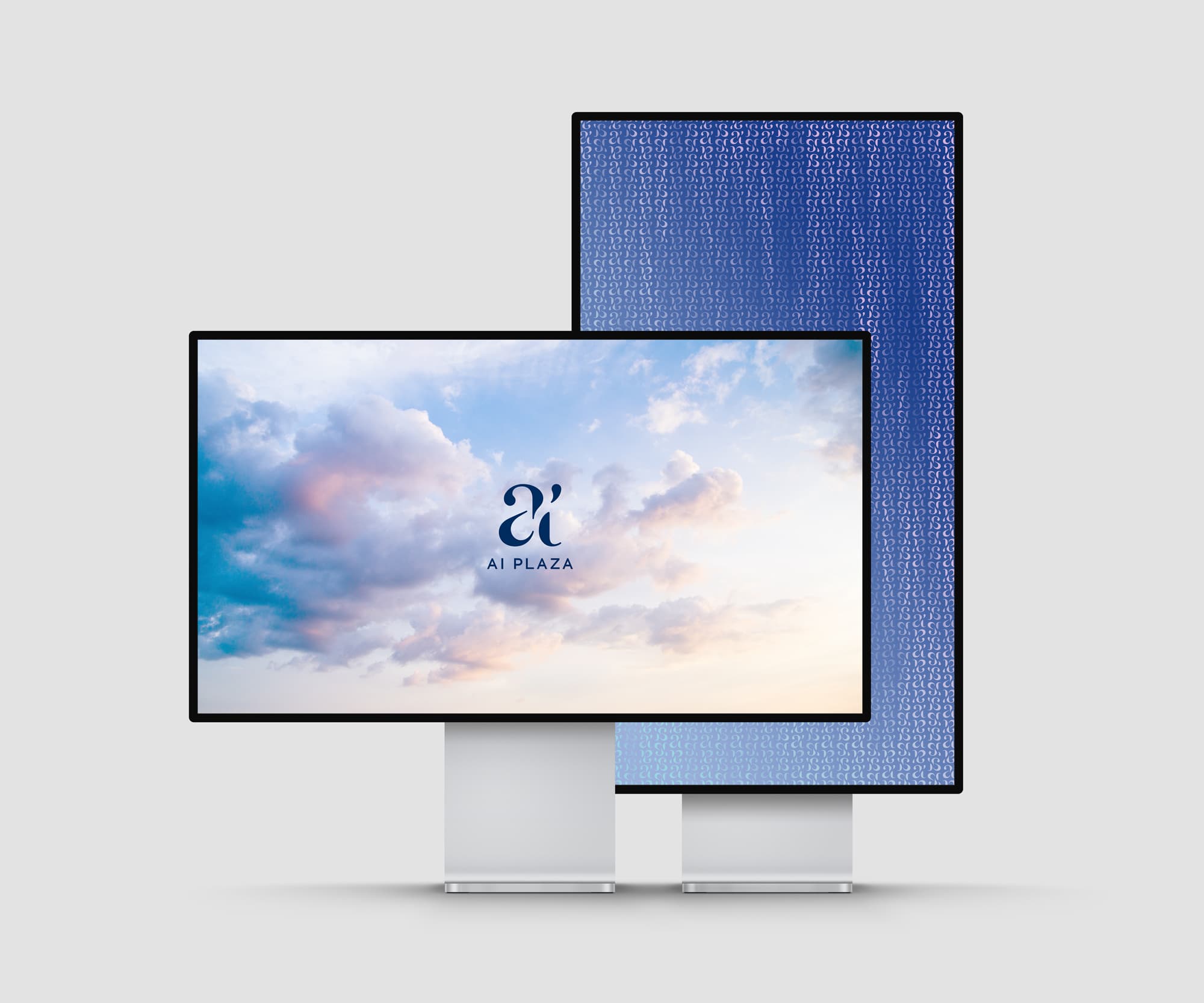
The graphic system is derived from the logo, blending artful expression with technological innovation. It consists of two key elements:
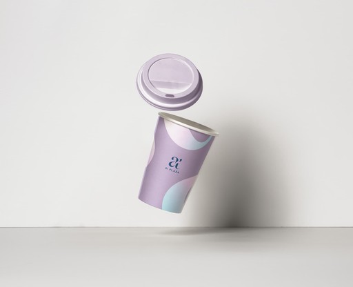
Macro Design System: The core visual identity, used for high-visibility brand materials like posters, advertisements, and promotional content. It represents the brand's bold, recognizable artistic side.
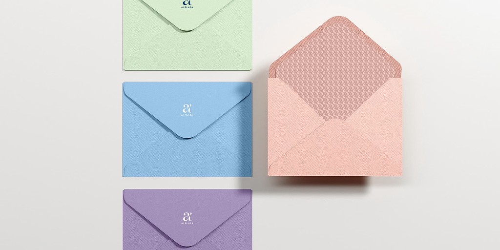
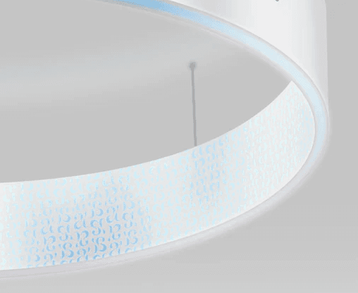
Micro Design System: A subtle, intricate layer used in finer details, symbolizing the sophistication and intelligence behind the brand. It appears in hidden areas or underlying elements, reinforcing the brand's depth.


Graphic System Application
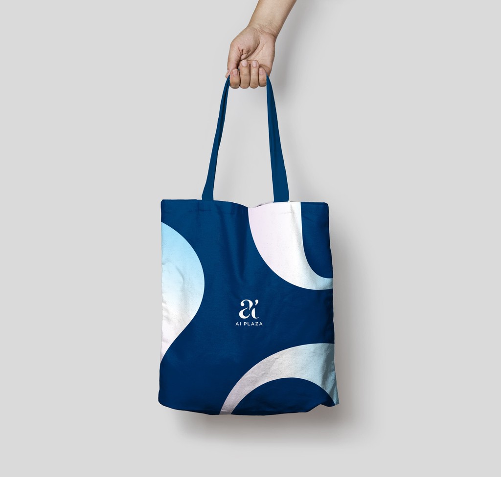
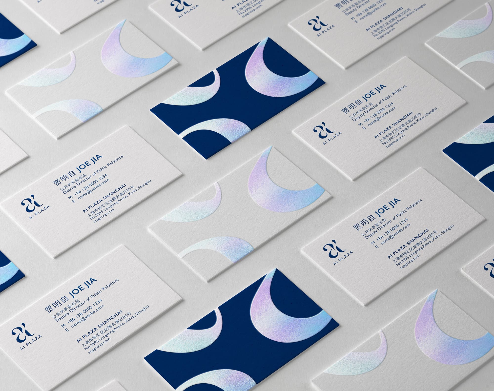
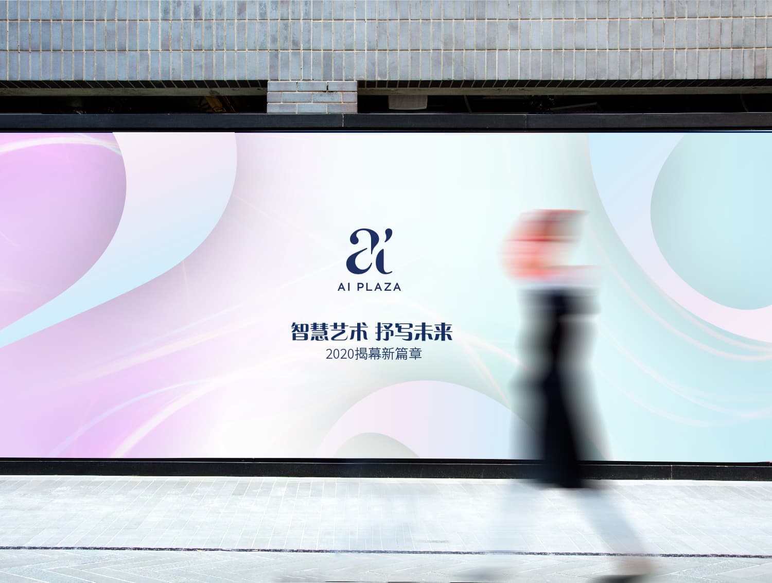
The graphic system adapting seamlessly throughout various touch points.

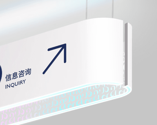
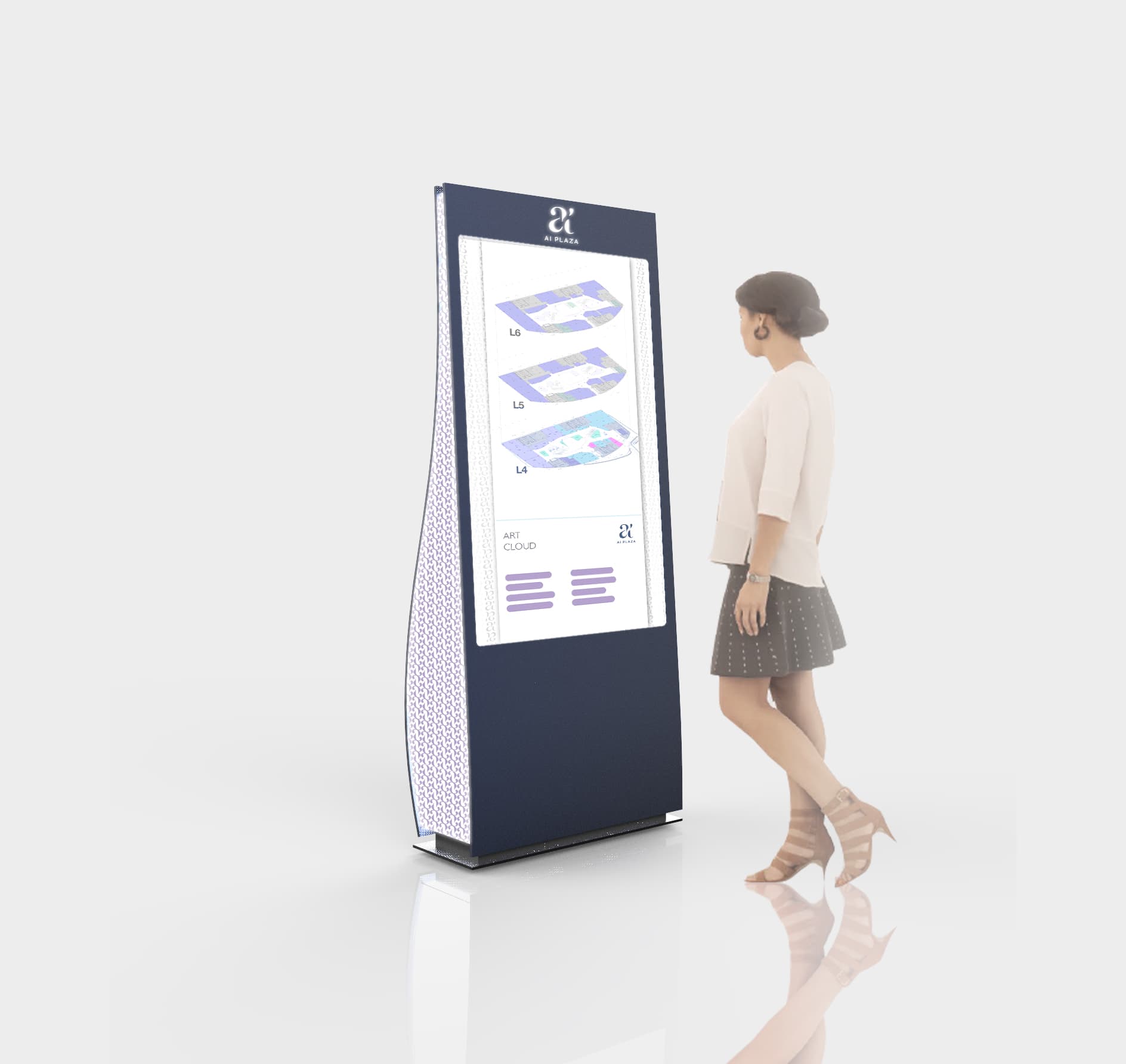
Signage Design
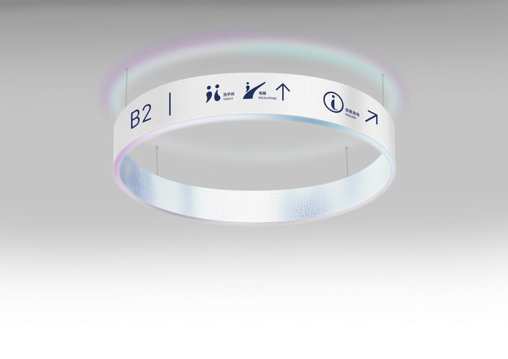
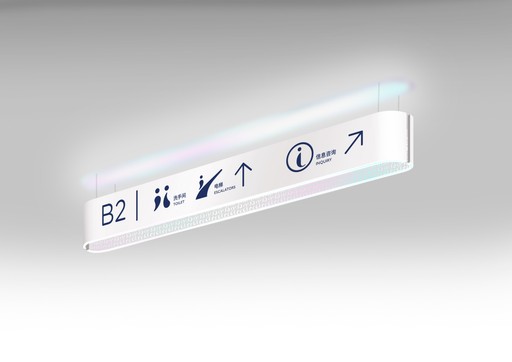
The shapes are designed with the same curves and cloud like movement of the brand logo. The iconography was inspired by the elements from the logo.
Outcome
The collaborative effort between the graphic design team and Woods Bagot's architects was critical to the success of the AI Plaza visual identity. This partnership resulted in a brand identity that is not only aesthetically innovative but also deeply resonant with the mall's architectural design. The final visual identity for AI Plaza stands out for its ability to merge the artistic and technological inspirations of the space, offering a distinctive and engaging experience for all visitors.

Interested in connecting?
Let’s talk projects, collaborations, or anything design!
Interested in connecting?
Let’s talk projects, collaborations, or anything design!
Interested in connecting?
Let’s talk projects, collaborations, or anything design!
