BFC celebrates the year of the Rooster
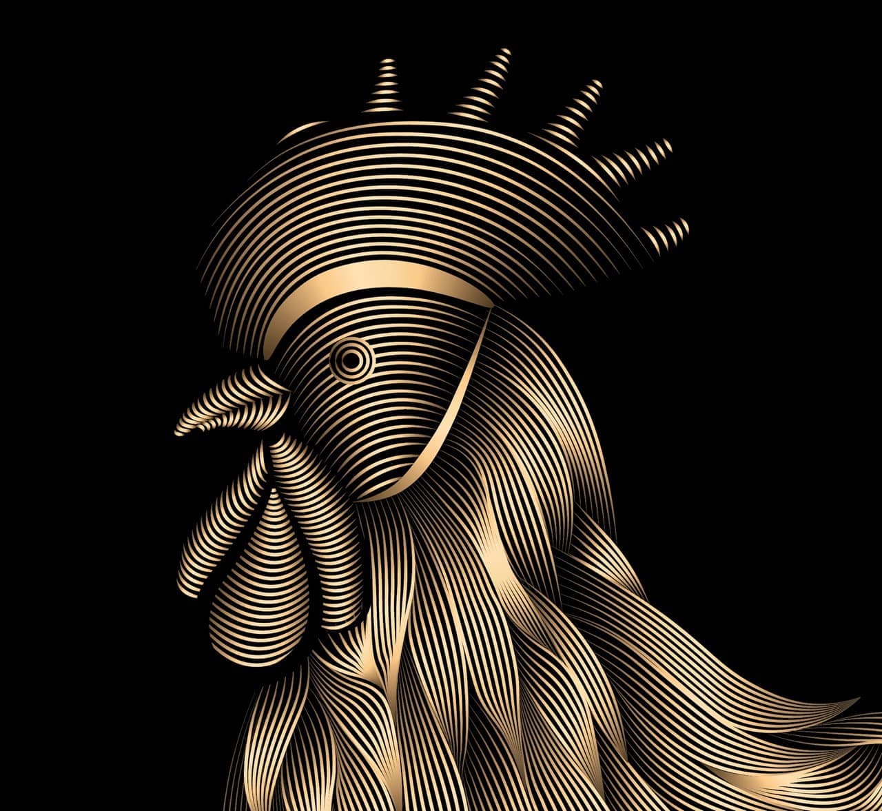
Rooster Illustration for Bund Financial Center in Shanghai, to celebrate the year of the rooster in 2017.
Role
Illustration
Industry
Retail and Architecture
Duration
1 week
Year of the Rooster: Bund Financial Centre Artwork
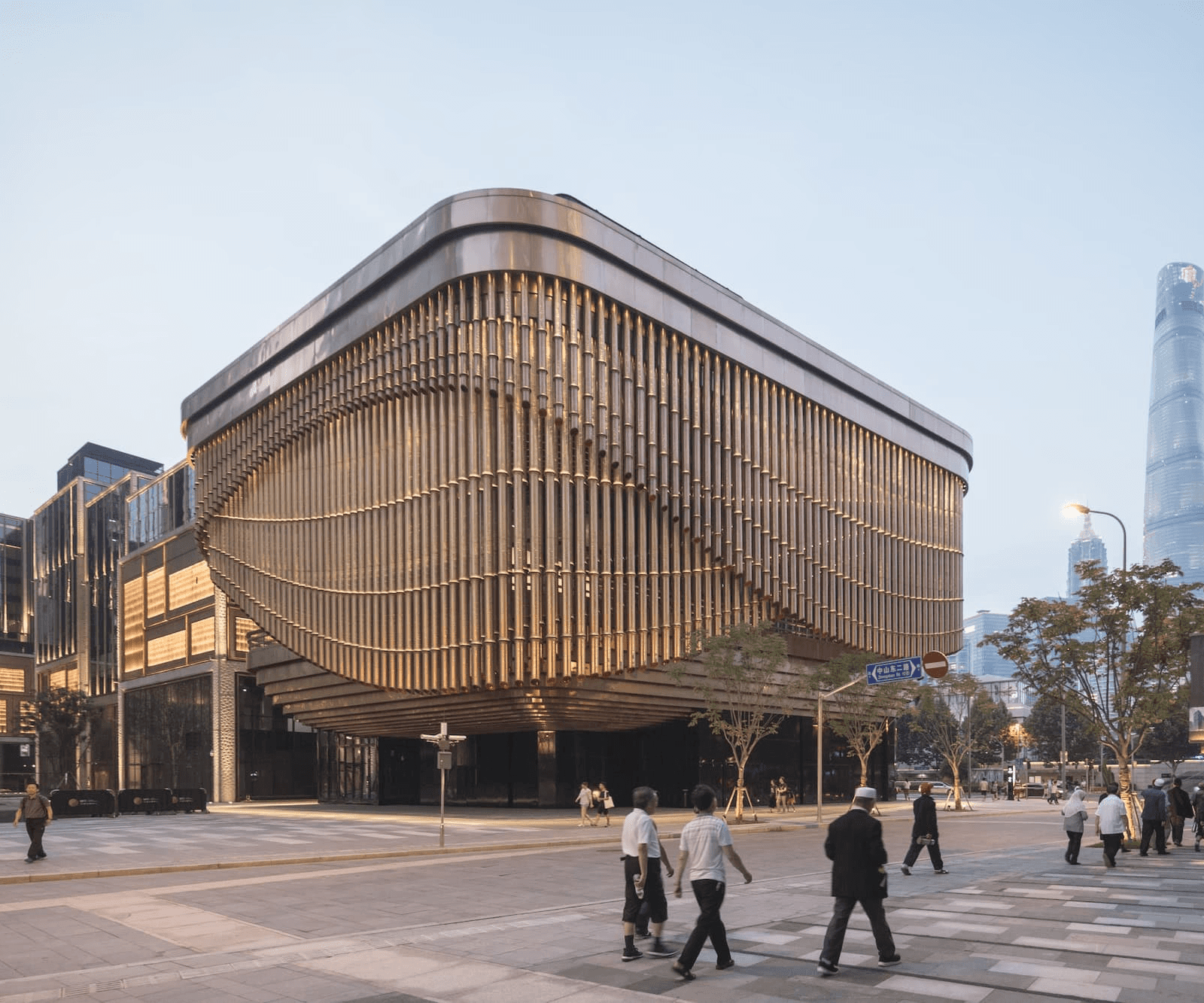
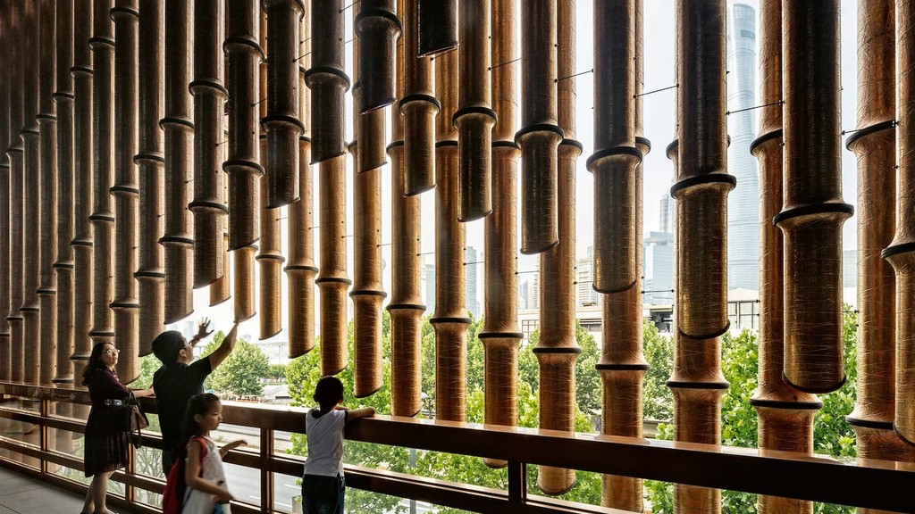
In 2017, to celebrate the Chinese New Year, I was commissioned to design a branding artwork for the Bund Financial Centre (BFC) in Shanghai, which coincided with the Year of the Rooster according to Chinese tradition. Inspired by the architectural design of BFC, known for its distinctive use of bold, prominent lines, I chose to reflect this characteristic in my illustration. The rooster artwork was crafted using dynamic line elements that echo the architecture's aesthetic, creating a visually cohesive and culturally resonant piece that celebrated the spirit of the New Year while paying homage to the unique identity of BFC.

Lines, strokes and a bit of adobe magic
I used adobe illustrator's blend tool to create a mesh of lines and mould them into the rooster's shape. I used a gradient with golden colour to represent the BFC's architecture.



Rooster's crowing across brand assets
The Rooster illustration received enthusiastic praise from the Bund Financial Centre's team. Following its success, the design was adapted across various branding assets, including hoardings and Chinese New Year greeting cards, further amplifying the festive spirit and enhancing brand cohesion during the celebrations.
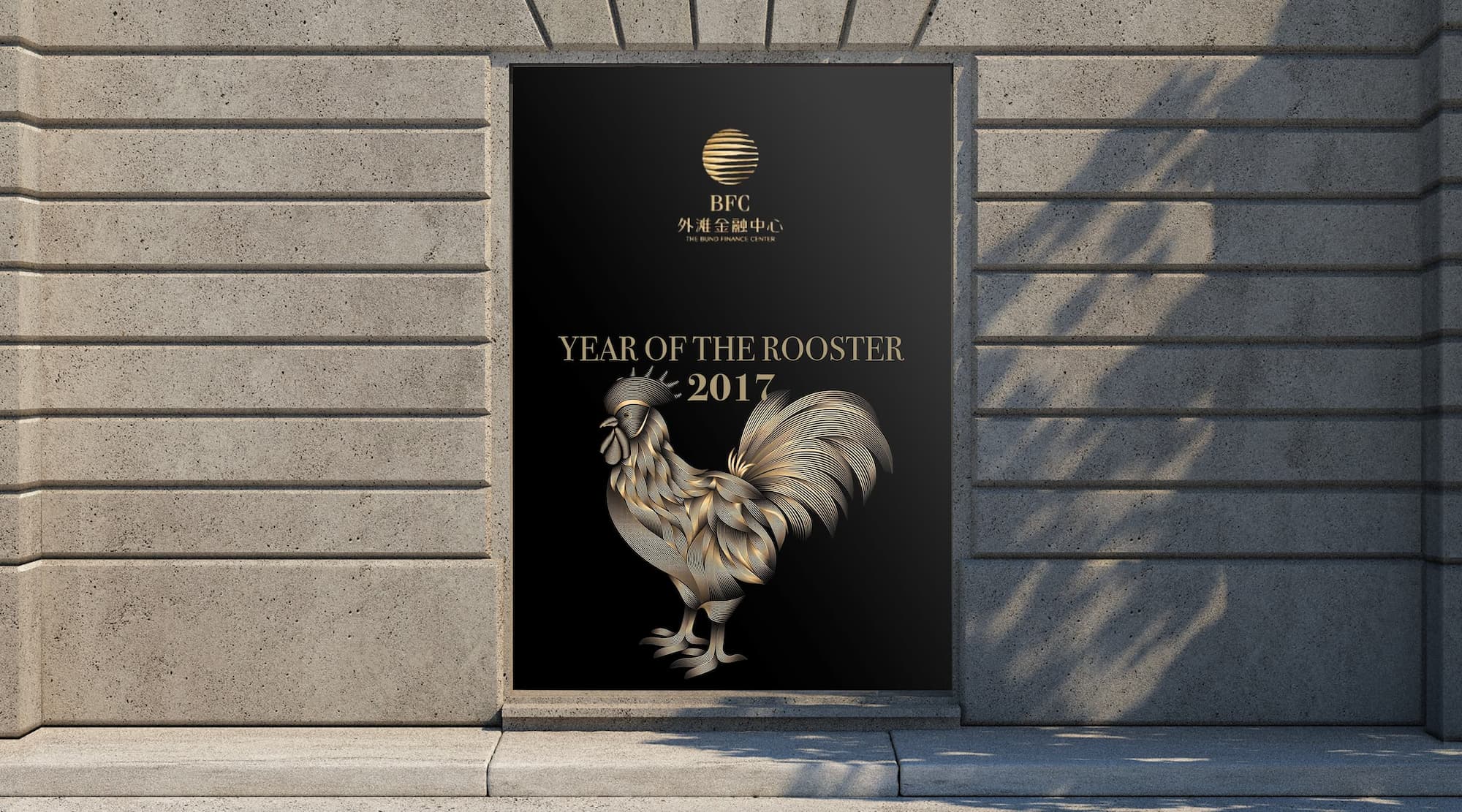
Same style, different adaptations..
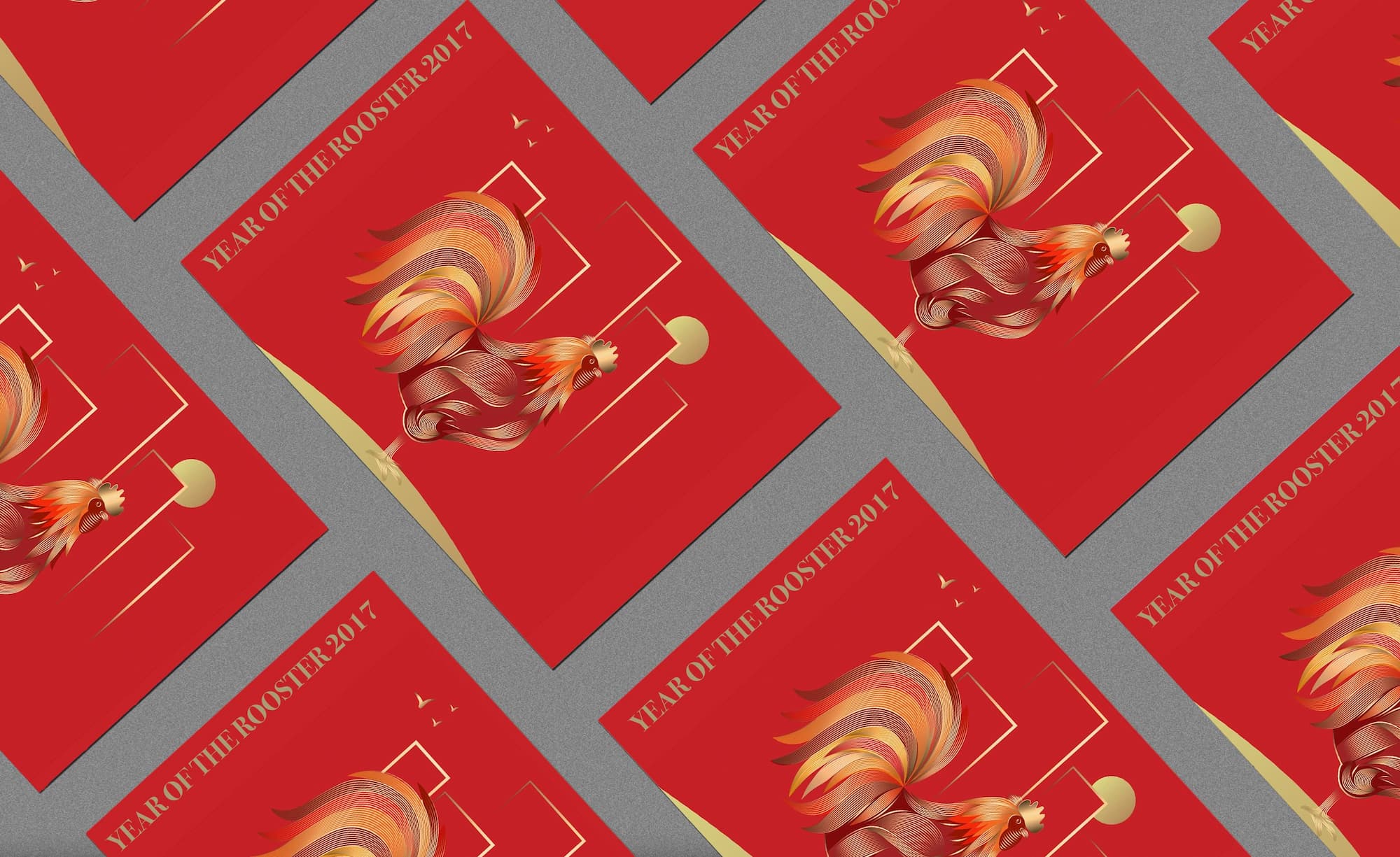
Building on the success of the original Rooster illustration, additional assets like posters and greeting cards were designed. These adaptations maintained the core style while incorporating new elements, such as the city skyline and colour variations, to add depth and context.

Outcome
The collaborative effort between the graphic design team and Woods Bagot's architects was critical to the success of the AI Plaza visual identity. This partnership resulted in a brand identity that is not only aesthetically innovative but also deeply resonant with the mall's architectural design. The final visual identity for AI Plaza stands out for its ability to merge the artistic and technological inspirations of the space, offering a distinctive and engaging experience for all visitors.
Interested in connecting?
Let’s talk projects, collaborations, or anything design!
Interested in connecting?
Let’s talk projects, collaborations, or anything design!
Interested in connecting?
Let’s talk projects, collaborations, or anything design!
