Nozama - Last Mile Drone Delivery App
An automated last-mile delivery solution using drones that may reduce last-mile delivery obstacles regarding time and expense.
Role
UX/UI Designer
Industry
Technology
Duration
8 weeks
Design Brief
As the demand for fast, seamless delivery experiences continues to rise, companies face increasing pressure to meet customer expectations. Research shows that 45% of consumers expect delivery within two hours, while 80% want real-time tracking. To address these demands, Nozama seeks an innovative last-mile delivery solution that reduces both time and costs while adapting to evolving market needs.
Context
With the growing demand for faster and more reliable deliveries, Nozama needed an innovative last-mile delivery solution to overcome the inefficiencies and high costs associated with traditional methods. The challenge was to design a user-friendly drone delivery app that could enhance the customer experience while addressing concerns around safety, accuracy, and flexibility.
Solution
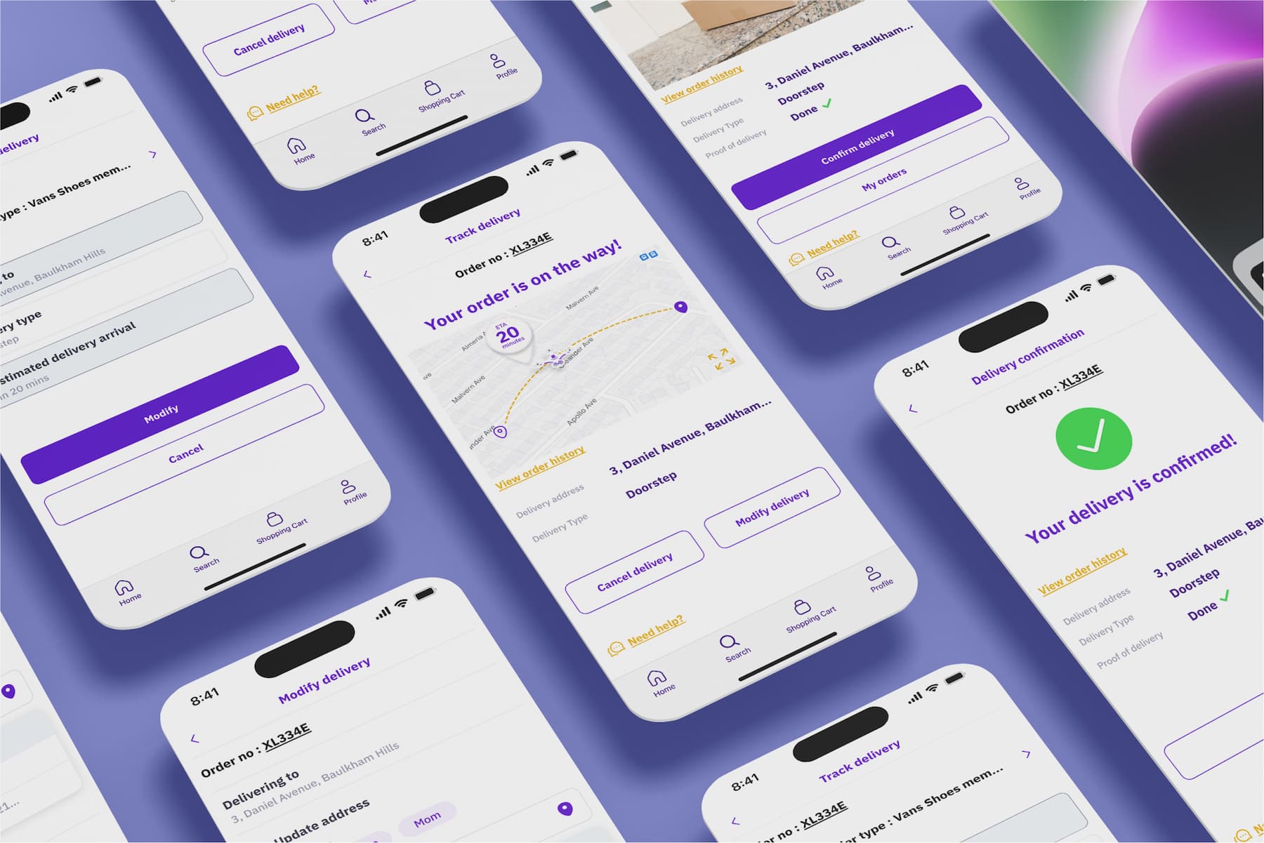
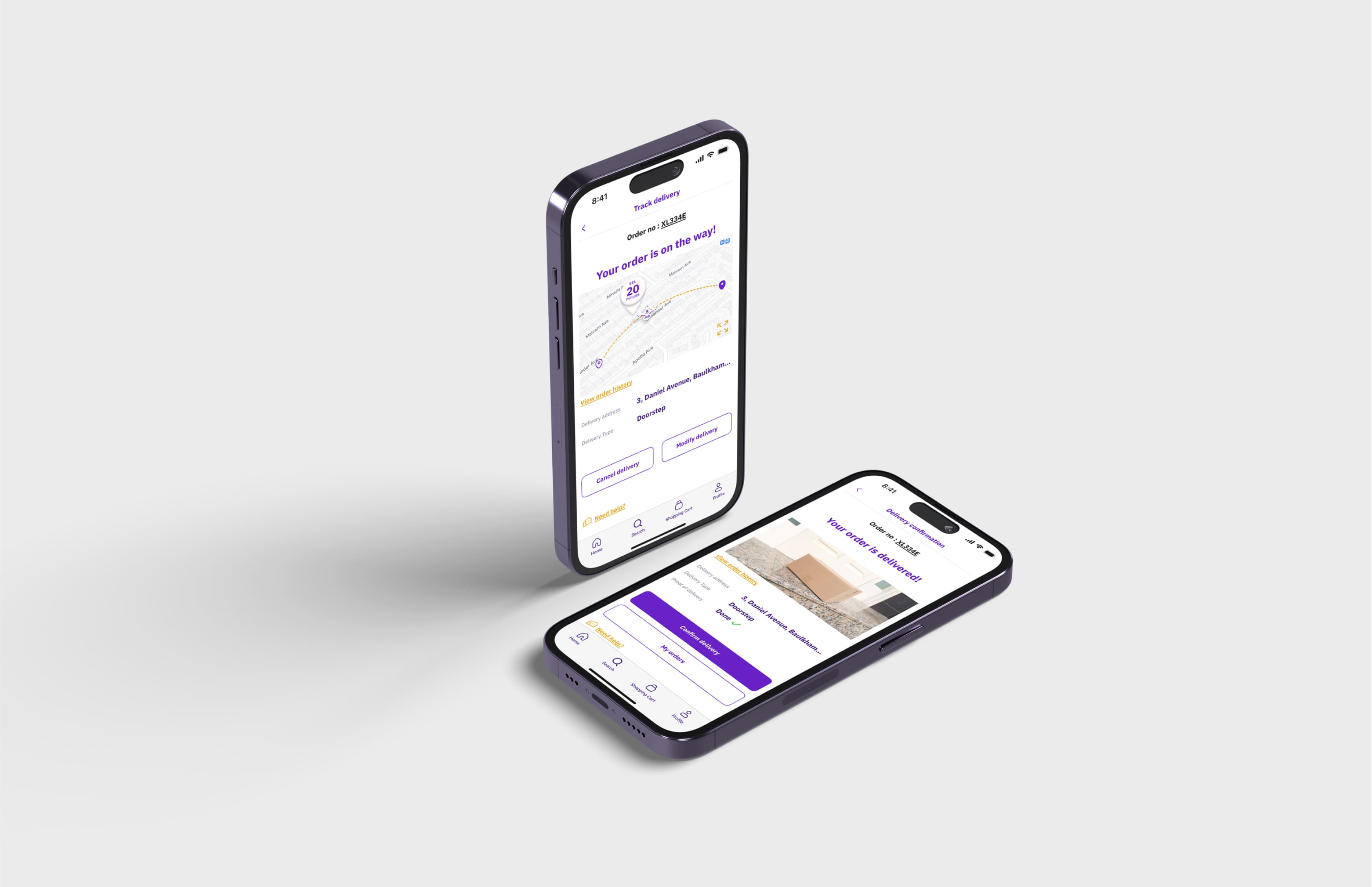
By conducting in-depth user research and competitor analysis, we developed a drone delivery app concept that integrates real-time tracking, flexible delivery options, and clear user interfaces. The design addressed key pain points such as modifying delivery details, ensuring accurate tracking, and simplifying the confirmation process, resulting in an intuitive and efficient delivery experience for users.
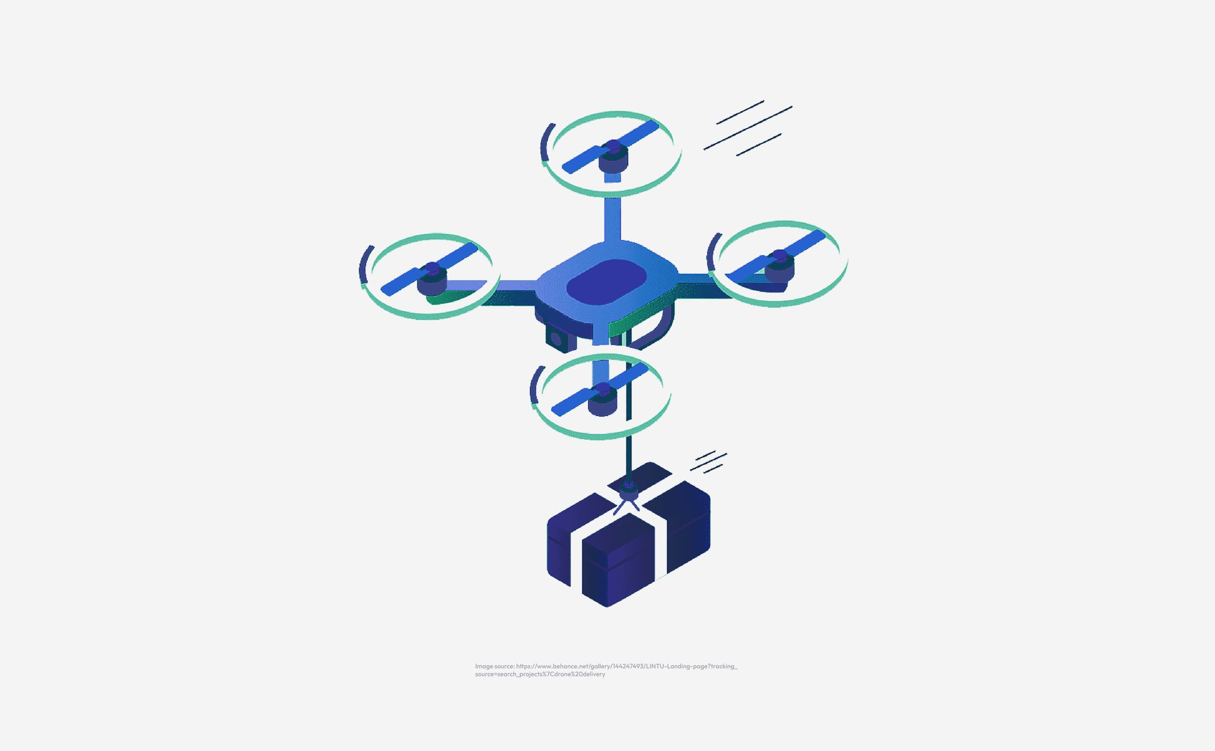
What is Automated Last-Mile Delivery
Last-mile delivery—the final step of transporting a product from the warehouse to the customer’s door—remains one of the most inefficient and costly stages in logistics, accounting for up to 28% of transportation costs. Our research identified key pain points through user analysis and competitor research, revealing both the opportunities and challenges presented by automation in delivery, projected to become a $9.8 billion industry by 2030.
Opportunities and Concerns
Advantages: Drone deliveries are 90% cheaper and are poised to expand into a $39 billion global market.
Challenges: Despite the cost benefits, 19% of consumers express concerns about drone safety, while 18% worry about job displacement due to automation. Additional issues include slow travel speeds, potential for lost deliveries, and environmental factors.
A balanced approach is crucial to aligning innovation with user concerns.
Research Stage
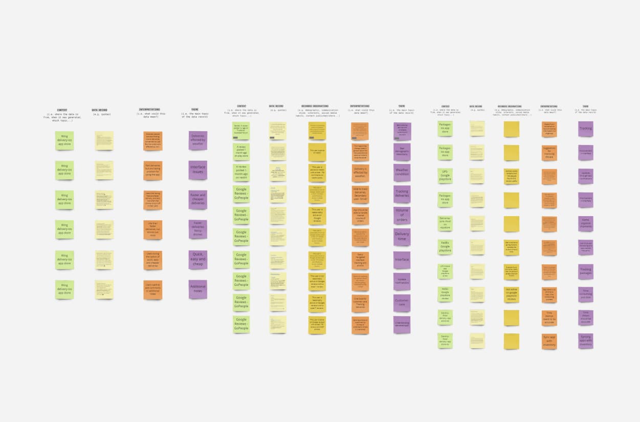
Online Ethnography Insights
Notifications: Users desire real-time tracking updates.
Seamless Tracking: Instant tracking when a tracking number is copied.
Accuracy: Accurate time stamps for better reliability.
Landing Detection: Improved options for drone or manual landing.
Address Flexibility: Easy modification of delivery addresses.
Competitor Analysis Insights
- Preferences: Users value fast, affordable, and simple drone deliveries.
- Frustrations: Common issues include inaccurate time stamps, imprecise tracking, theft concerns, and drones failing to identify suitable landing areas.
- Desired Features: Users want flexible options to modify delivery locations, times, and methods, as well as the ability to add specific instructions or notes to their orders.
Ideation Stage
- Allowing users to modify delivery locations easily.
- Providing timely notifications about delivery status.
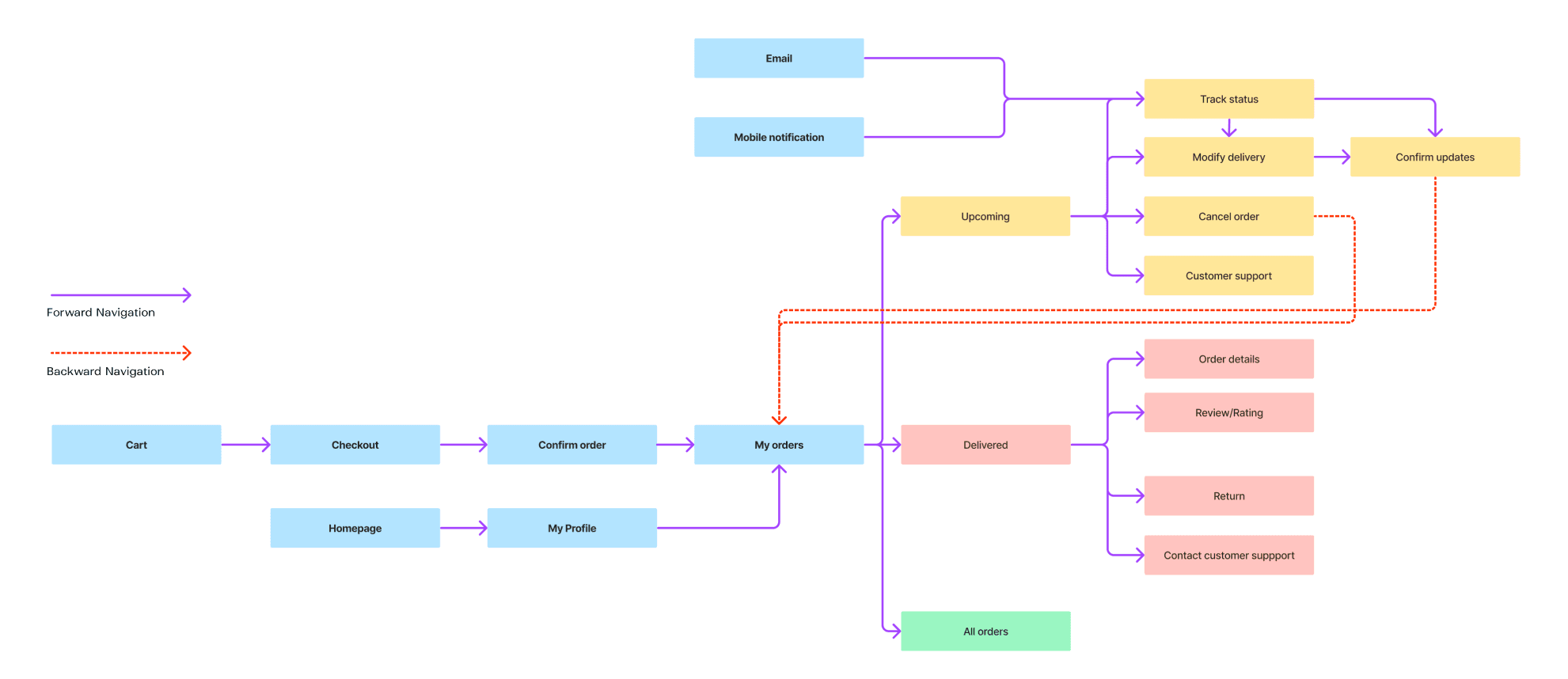
User Flow
- Navigating from the shopping cart.
- Accessing the profile page.
- Engaging with notification pop-ups.
Interaction Process
The user opens the app and checks order status via "My Profile."
They select "My Orders" and track the order.
The user follows the on-screen instructions to prepare for delivery.
The package arrives, with a photo confirmation at the doorstep.
The user confirms delivery by scanning the QR code on the package
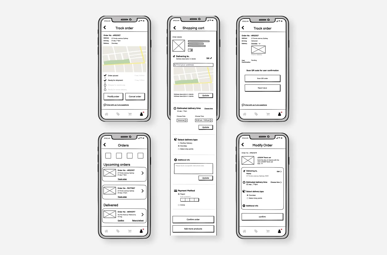
Prototypes for testing
We tested our prototypes using the Think Aloud method, observing user interactions and iterating based on feedback. The design evolved from low to high fidelity, incorporating insights from user testing and heuristic evaluations.
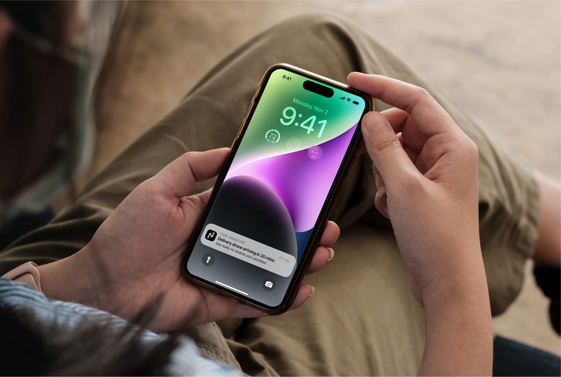
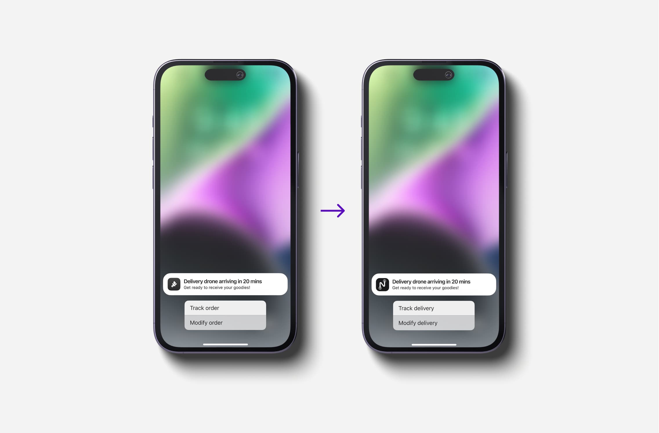
Notification Screen Evolution
Initial design offered "Track order" and "Modify order" options. User feedback indicated confusion around the term "order," leading us to change the wording to clarify that only the delivery could be modified.
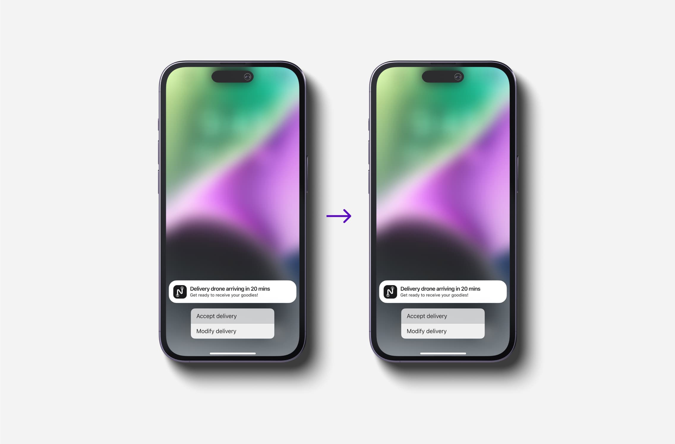
Further testing led us to replace "Track delivery" with "Accept delivery" to streamline the process, but this was ultimately reverted based on user preference for simplicity.
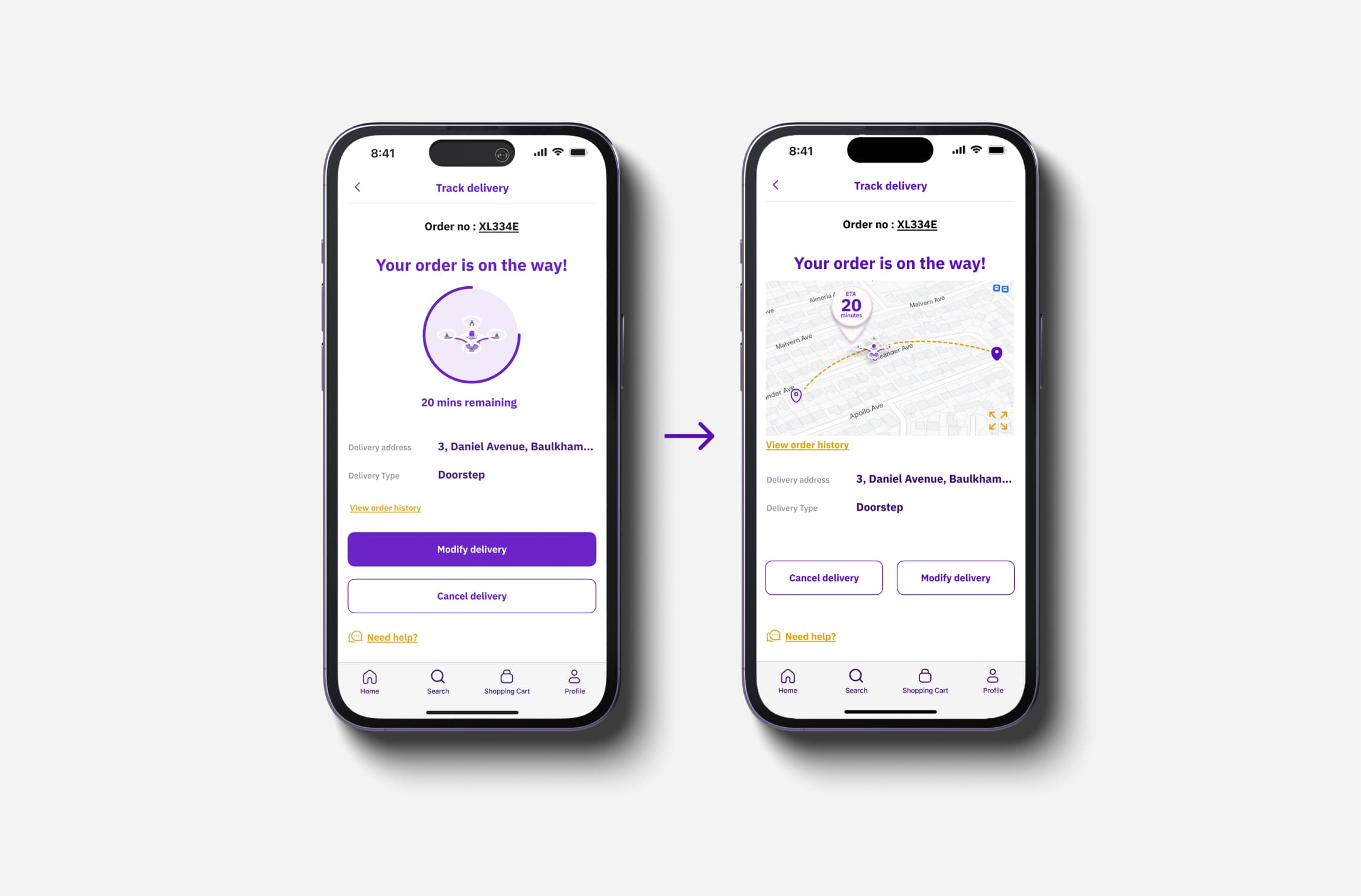
Track Order Page Refinements
User feedback suggested simplifying the screen by removing unnecessary order history and emphasizing the time of delivery with an animated progress bar.
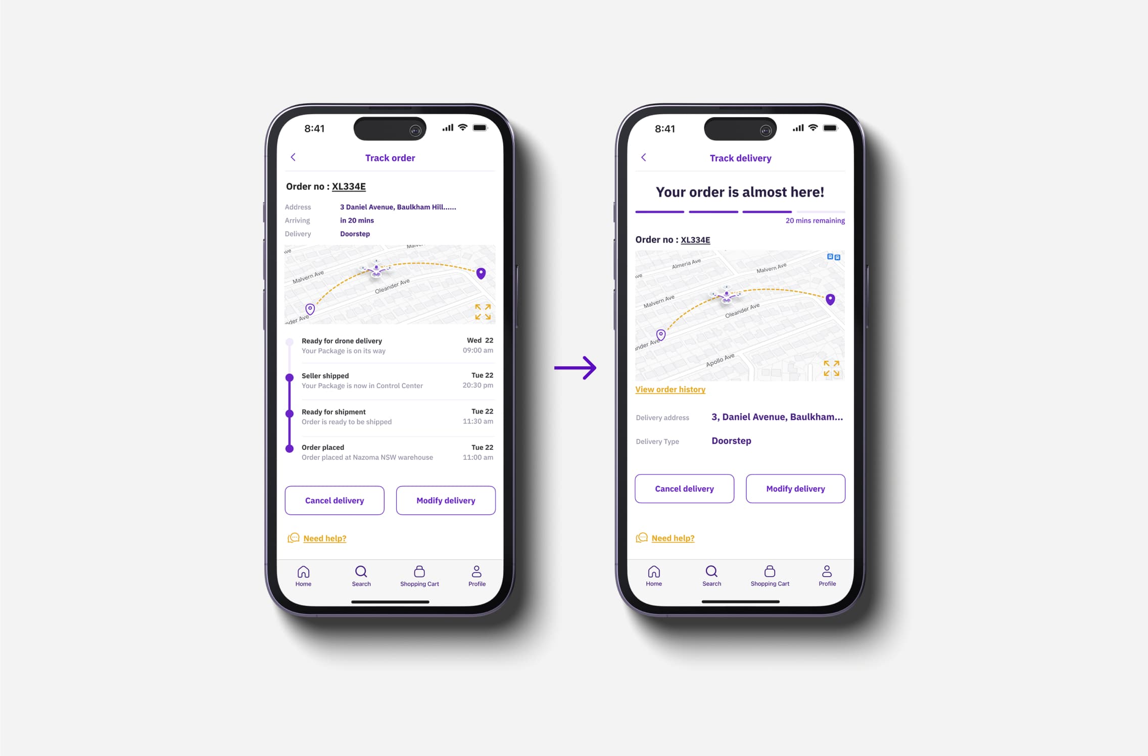
After further testing, we reinstated the map visual alongside the prominent time remaining, ensuring the UI remained user-friendly.
Delivery Confirmation Page Enhancements
Initial designs left users confused about how to confirm delivery. We added a clear message at the top and used checkmarks to indicate progress.
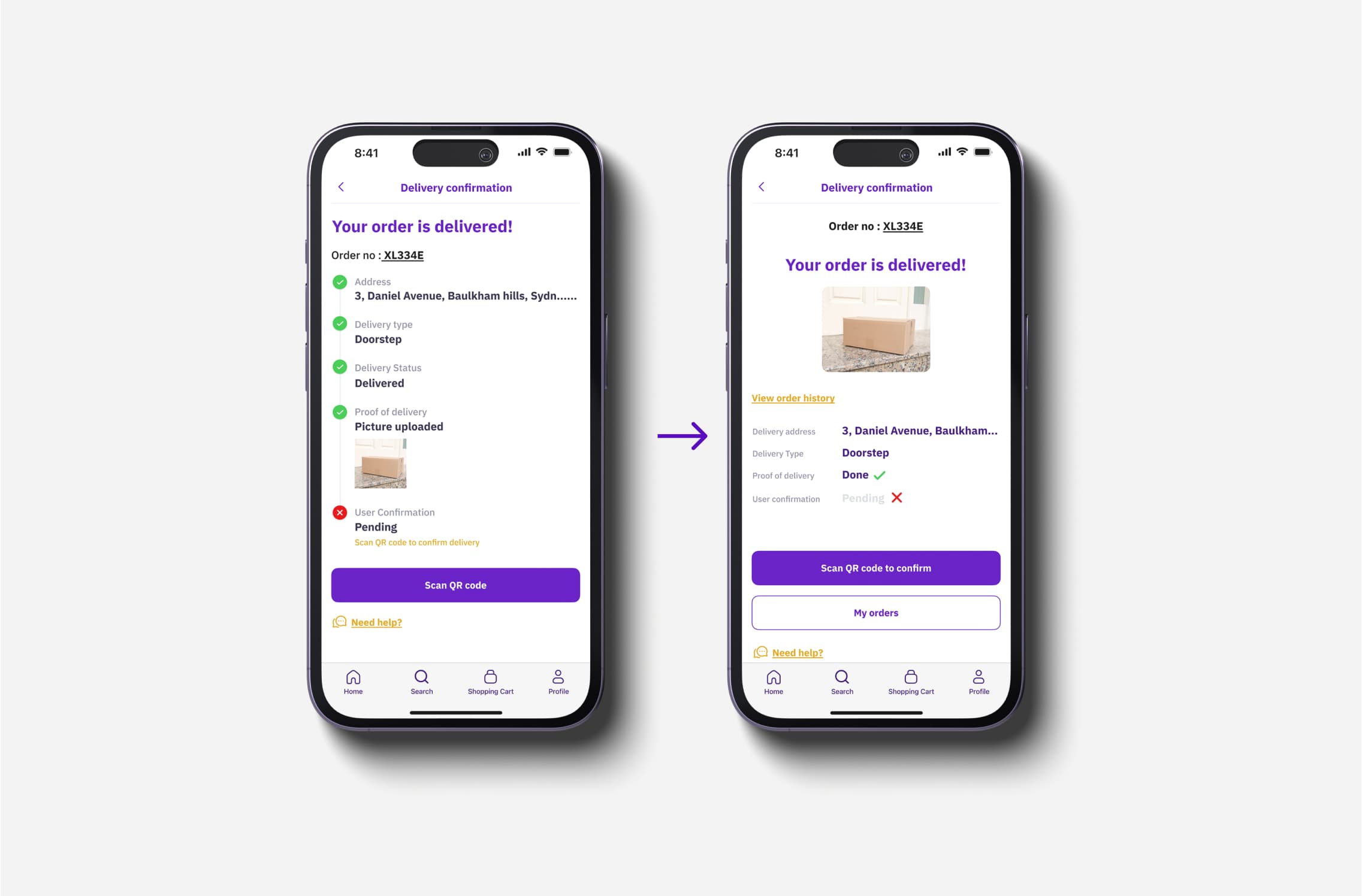
Further refinements included a clear delivery message, proof of delivery image, and an explanatory CTA for scanning the QR code.
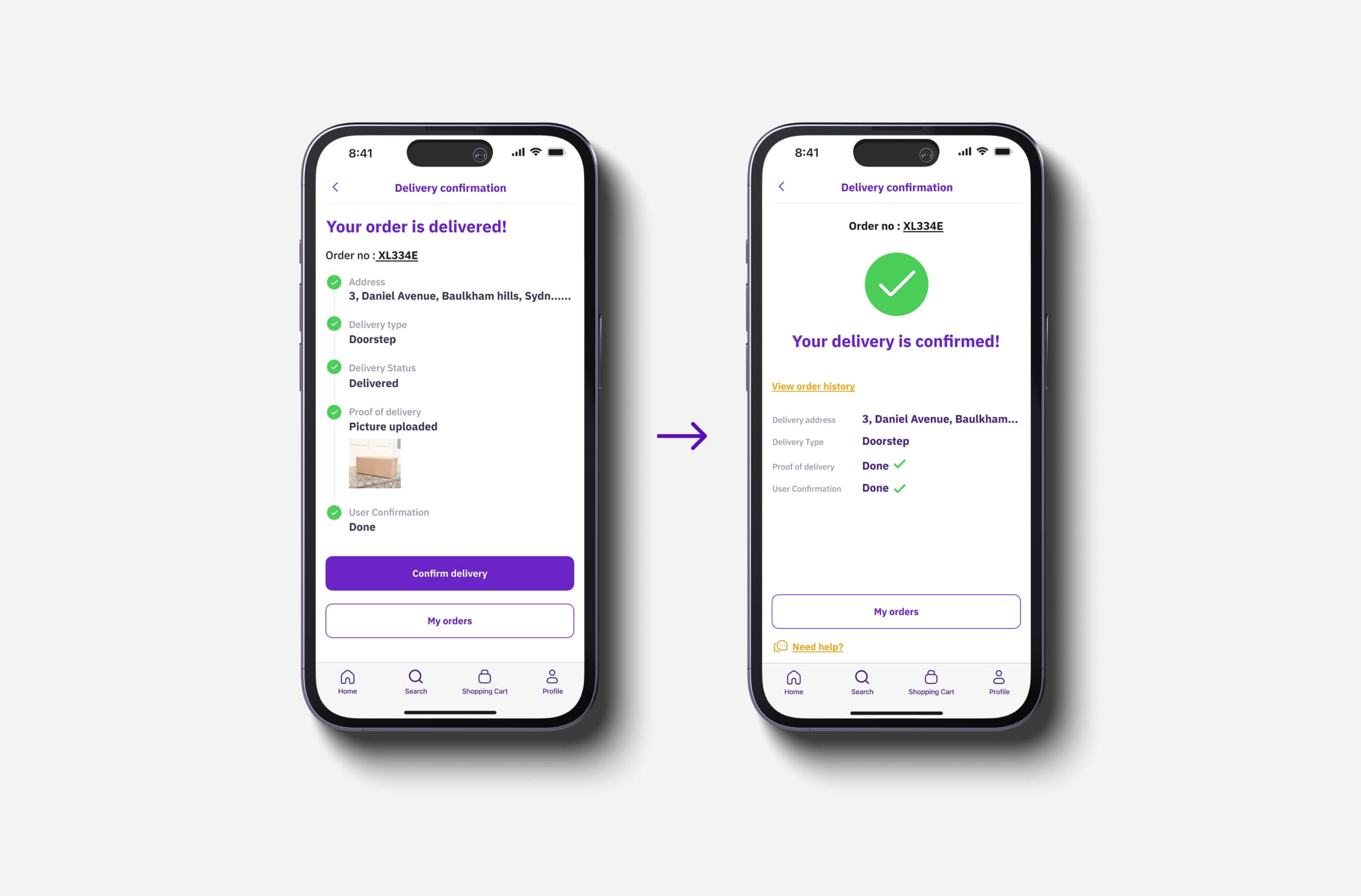
Final Prototype in action
Figma preview of final prototype was showcased to other students in the class. it helped us gather more feedback and ideas from fellow students, which would help us further refine the concept.
Reflection
Presenting this concept to a panel of professors and peers provided valuable insights for future refinement. This project was a rewarding learning experience, deepening my understanding of the drone market and consumer expectations. Through user testing and iteration, we honed in on the key features that made our design concept both innovative and user-centric.
Interested in connecting?
Let’s talk projects, collaborations, or anything design!
Interested in connecting?
Let’s talk projects, collaborations, or anything design!
Interested in connecting?
Let’s talk projects, collaborations, or anything design!
